
5 Types Of Distress Ink Backgrounds Not Just For Christmas | CHRISTMAS CARDS 2023 - #2 + VIDEO10/11/2023 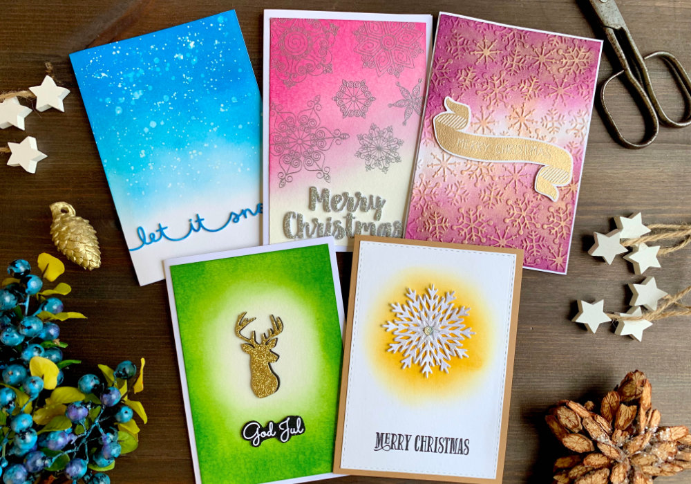 Creating Distress ink backgrounds with various colour combination is one of my favourite things to do. I created quite a few in the past few years and you can see them all here. Before I continue to make more background, I wanted to give you a few ideas what kind of backgrounds you can make and at the same time make a few Christmas cards. I also thought it would be a fun to challenge myself and use just one ink for each card, but feel free to use more. Just add different colour to my white. NOTE:
BLENDING TYPE 1: Blending straight from top to bottom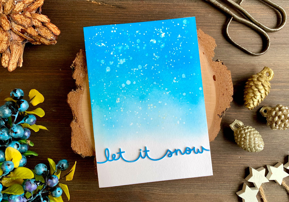 This is probably one of the most common blending types. Creating a simple straight gradient. I used the Salty Ocean ink to create a blue background and I blended the ink heavily at the top, adding multiple layers to get very saturated colour. This is just because I was using one ink. And I was decreasing the saturation as I was moving downwards fading the colour into white. I was creating a sky and since I'm making a winter card, I wanted to add some snowflakes. The easiest way to achieve that is to do the very typical Distress ink technique. Add some splatter, just a clean water and soak it up with a paper towel. Later I also used gouache for more white snowflakes. 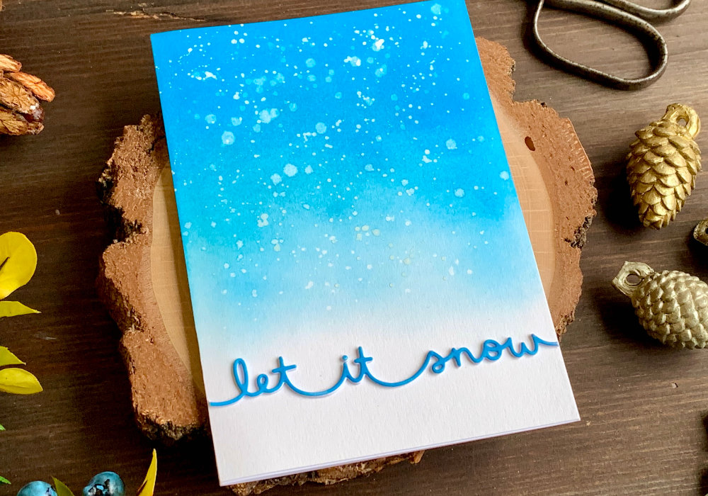 To finish up the card I adhered the panel on top of a white card base and I adhered a simple die-cut greeting. Since I created a snowy sky, I thought using a sentiment die that says Let It Snow is perfect. I die-cut it three times out of a white card stock. For one of the die-cuts I used the Salty Ocean ink and I applied the colour across the sentiment to make it blue. Then I adhered all the die-cuts together. Once the glue was dry I adhered the greeting on top of the card, below the snowy sky. The greeting was a little bit too wide, so I cut of the excess with my scissors. BLENDING TYPE 2: Blending diagonally from top to bottom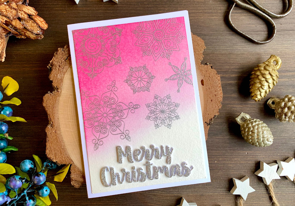 Here I used pink, the Picked Raspberry ink. I think it's a fun colour and fits the overall look of the card. Just like on the previous card I started at the top with a heavy ink application and I was decreasing the saturation fading into white towards the bottom. I was applying the ink diagonally from left top corner towards the bottom right corner. I let the background fully air-dry. I needed the background to be completely dry, because I was going to do heat embossing. You don't need to air dry, this is something I prefer to do, you can use a heat tool or heat emboss first and then apply the inks. 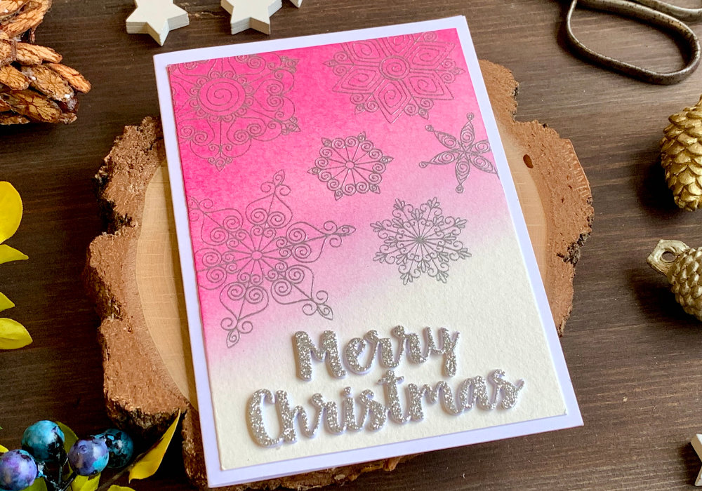 For this background I wanted to use snowflakes and I only one such stamp set. I placed them into my stamping tool, I treated the card stock with an antistatic powder, inked up the stamps with the Versamark ink, sprinkled a sliver metallic embossing powder over it and heat set it with my heat tool. The background I adhered on top of a white card base. For the greeting I used a Merry Christmas die. I die-cut it twice out of a white card stock and once out of a silver glitter card stock. I adhered all of the die-cuts together and then I attached the whole piece on top of the card. BLENDING TYPE 3: Double-sided diagonal blending with a gap in the middle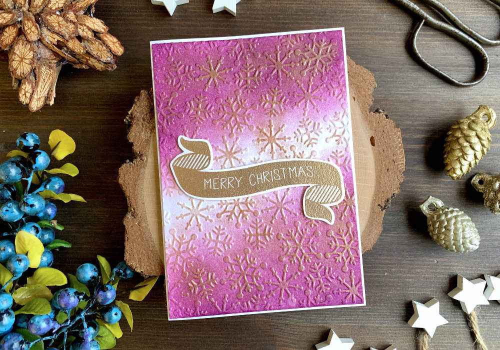 For this card I used purple ink, the Seedless Preserves. I blended the ink diagonally again, but instead of going from just top to bottom, I also went from bottom to top, leaving a light gap in the middle. Again at the top and bottom corner I applied heavier coat of colour, starting to fade it out quarter of the way, making sure the middle is white. To make it into a card I decide to use the Perfect Pearls again, this time with an embossing folder with snowflakes. 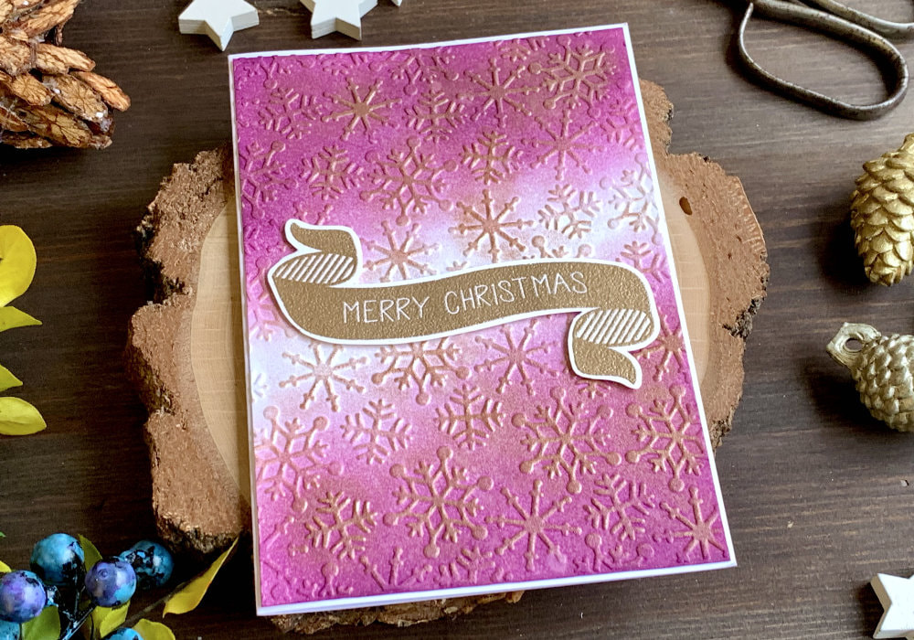 After I run the panel through my die-cutting machine I dabbed the Versamark ink over the raised areas, then I applied the powder using a brush and sprayed it with clean water to set the powder. I adhered the panel on top of a white card base and using a foam tape I attached a simple Merry Christmas greeting banner that I stamped and heat embossed using a bronze embossing powder. BONUS BLENDING TYPE IDEA: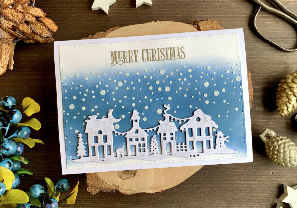 I made this card into bonus one, simply because I made seven cards and one was horizontal, which was annoying to photograph, especially for the thumbnail for the video. In general multiple cards are difficult to photograph. The idea for this card was the opposite of the first blending type. Blending from bottom to top. I also knew that I wanted to use a die-cut of a Christmas village and I realized that there is a snow at the bottom. So I kept the fade at the top as planned, but I also faded the colour towards the bottom and I applied the ink only over the middle part of the panel, closer to the bottom . For the die-cuts I did it the other way round, compared to the other cards. I used the white die-cut for the top and for the bottom I die-cut two shapes out of a dark blue card stock and I adhered them on top of each other. 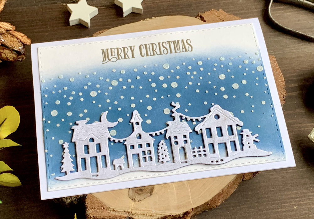 Before I adhered the die-cut piece on top of the card, I first wanted to add snowflakes across the blue background. This time however, I used a stencil with snowy background and embossing paste. After the paste was dry, I stamped and heat embossed a Merry Christmas sentiment, then I adhered the Christmas village at the bottom of the panel and using a liquid glue I attached the panel on top of a white card base. Lastly I used a glitter pen and applied it over the die-cut village, just to add a little bit of shimmer to the card. BLENDING TYPE 4: Blending from center out creating a circle or an oval shape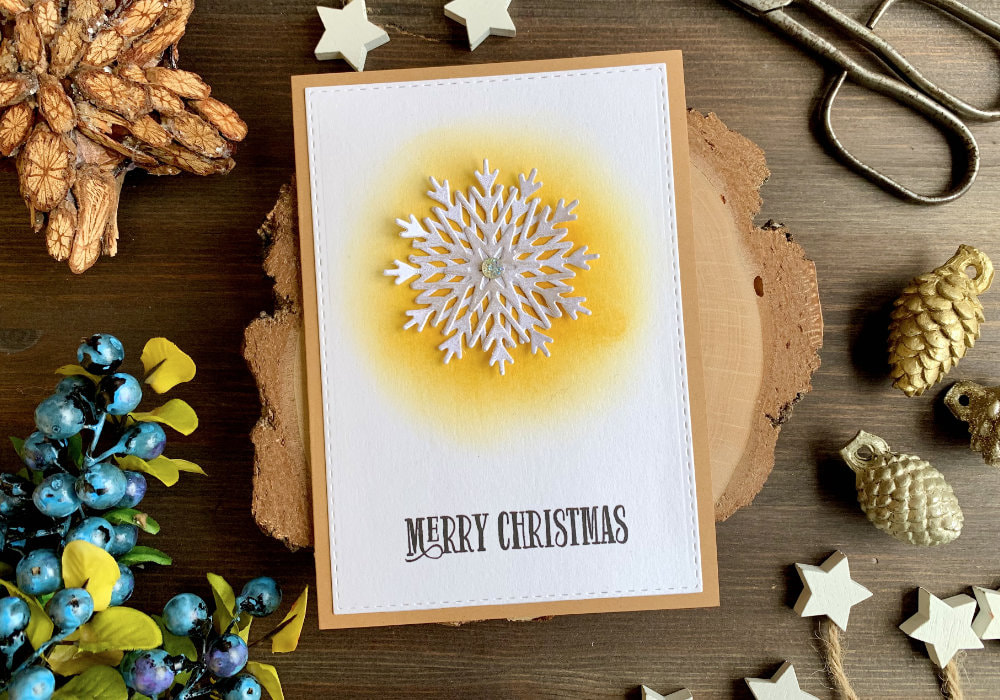 This type of blending is perfect for creating a background for a focal point, especially if you are using one colour or similar shade. If you don't there are more options how you can finish the card. For this background the darker shade is in the middle, going lighter as you are moving outwards and you can either create a circle or an oval shape. This is mainly important if you are creating a background for a focal point. It's good to match the shape of the background to the shape of the focal point. I picked very unusual colour for a Christmas card, but I think it still fits. I picked yellow, the Fossilized Amber and I applied the ink in the middle, creating a circle, fading the colour outwards. I created a circle to fit my focal point, which is a die-cut snowflake. 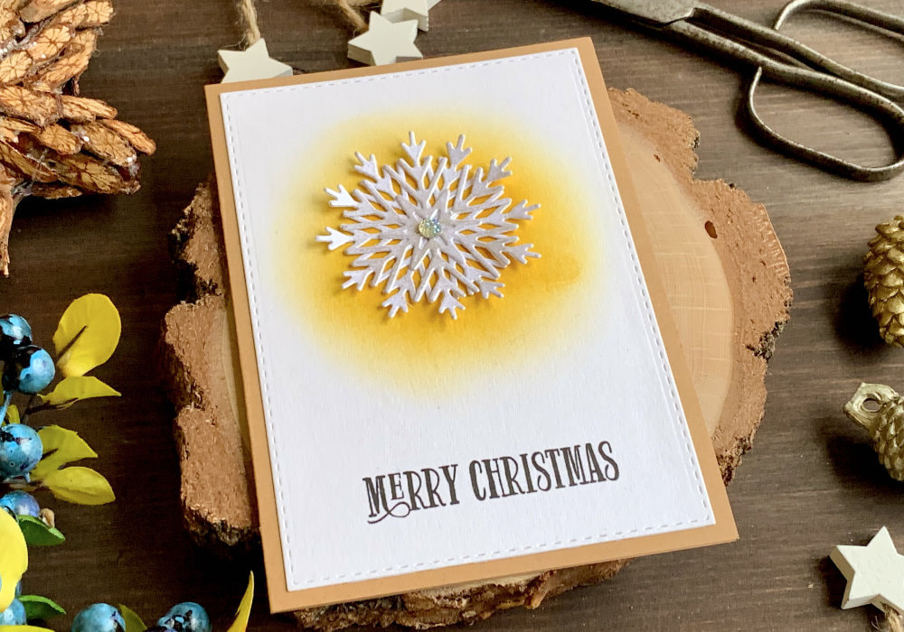 I die-cut two of them and to add a sparkle to the snowflakes I used the Perfect Pearls again, this time I used the Perfect Pearl colour. I dipped the snowflakes into the Versamark ink pad, then I applied the Perfect Pearls and sprayed it with water, which should set the powder. While the snowflakes were drying, I stamped a Merry Christmas greeting at the bottom of the panel using a black ink. Next I adhered the snowflakes over the yellow background. I only applied the glue in the middle section of the snowflakes. To make the snowflake look fuller, I adhered the second one over the first snowflake, but at a different angle. Lastly I used a glittery embellishment and I attached it in the middle of the snowflake and I also carefully rolled up or lifted the ends of the snowflake to give it more dimension. BLENDING TYPE 5: Blending from outside in creating a circle or an oval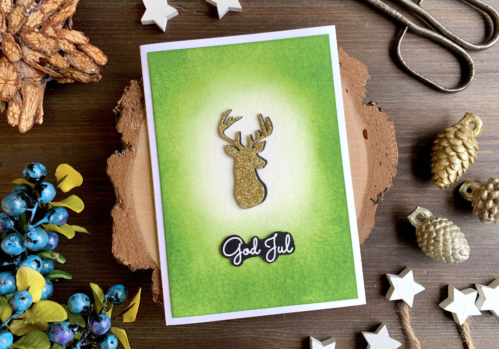 This card is the opposite of the other one. Here you make the outside darker and the inside lighter, creating an oval or circle. This would be the blending type out of those two I would use the most. Here I sued green, the Mowed Lawn ink. I applied a very heavy coat of the ink along the edges of the card stock, decreasing the saturation and fading it out towards the middle. The shape I was creating was an oval to fit the focal point I was going to use. I used a die of a silhouette of a head of a deer. I die-cut one out of a black card stock and one out of a gold glitter card stock. I adhered them together in a way so it’s a little bit off-set and you can see the black behind the gold. 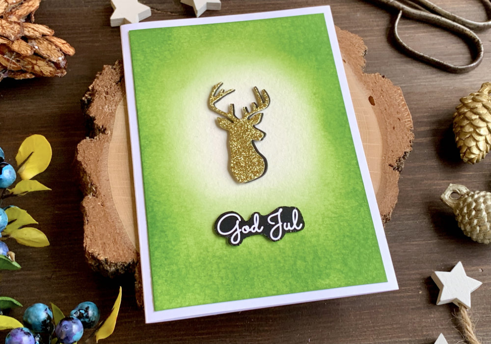 For the greeting I thought I will use a sentiment from the country where I live, which is Sweden. They say here God Jul, meaning Merry Christmas. I don’t have any stamps, so I printed out a few greetings and I cut out them with my scissors. To finish up the card I attached the background on top of a white card base using a liquid glue and the die-cut deer and the greeting I adhered on top of the panel using a foam tape. BONUS BLENDING TYPE IDEA: Using coloured card stock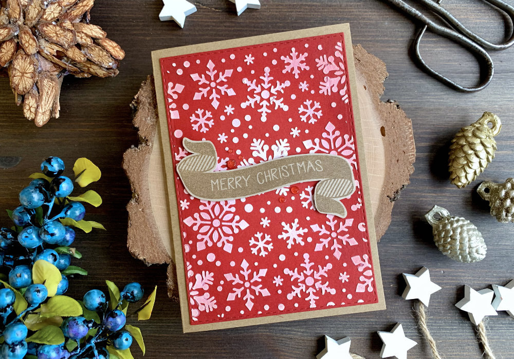 I used a white card stock for all of the backgrounds, but if you have just one ink, you could use coloured card stock. Lighter shade card stock would be the best, as you can create a gradient much easier, but I used a darker red card stock and the Fired Brick Distress ink and it worked well. I created the oval shape, like on the previous card, leaving the middle without any additional colour. Here I didn't create a focal point, I used another stencil this time with snowflakes and embossing paste. Once the paste was dry, I adhered it on to a craft card base and added a banner with a greeting. The greeting I stamped using a brown ink onto a craft card stock. 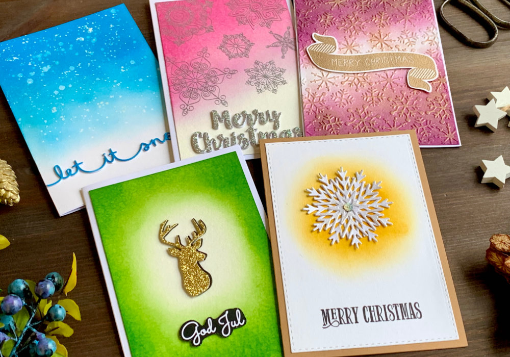 Those are all the backgrounds I have for you. There are a few more that I can think of, but the blog post is already too long and the ideas are different versions of what I already made. I will leave it for another time. I hope you are inspired and will try some of these backgrounds yourself. Make sure you check out my video on YouTube and give it a Like as well. If you would like to see all of my Distress ink colour combination, click here. And if you have any questions, just drop me a line. VIDEO TUTORIALWatch the video below or on my YouTube Channel. YOU MIGHT ALSO LIKE 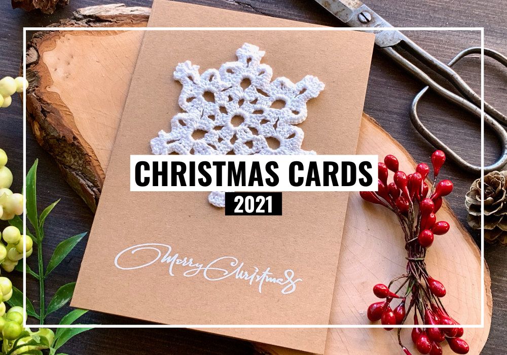 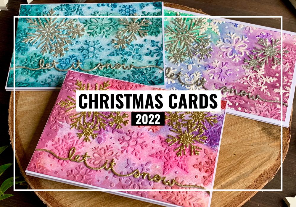 PIN MEDid you like the card? I would love, if you pinned it to your board on Pinterest! 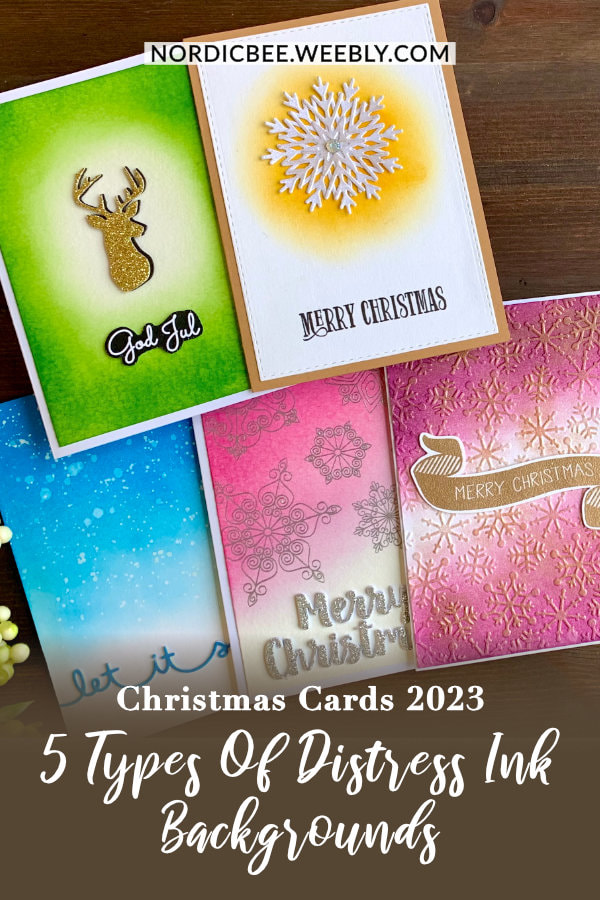
0 Comments
Leave a Reply. |
FOLLOW ME
SEE MORE
CATEGORIES
All
Stamping Die Cutting Using Stencil Heat Embossing Embossing or Texture Paste Distress Inks Nuvo Products Stamping & Colouring Stamping With Solid Stamps Watercolouring Watercolour Pencils Waterbased Markers Pencil Colouring Alcohol Markers Altenew Markers Zig Brush Markers Easy Backgrounds Stamped Backgrounds Small Stamp Ideas Simple Cards Complex Cards Cardmaking For Beginners All
Painting With Acrylics Painting With Gouache Painting With Watercolours Drawing With Fineliner Minimal Supplies Cards Christmas & Holiday
Love & Valentine Mother's Day Father's Day Halloween Spring Cards Summer Cards Autumn/Fall Cards Winter Cards Cards For Children Cards For Women Cards For Men Thank You Cards Sympathy Cards Get Well Soon Cards Floral & Leav Cards Rainbow Colours Messy Watercolouring Modern Art Inspirations Geometric Patterns Landscape Painting Acrylics
Gouache Watercolours Watercolour Pencils Waterbased Markers Distress Inks Alcohol Markers Colouring Pencils No Stamps No Dies Cards
Cardmaking On A Budget Let’s Colour Quick Cards Fun Masculine Cards Background Ideas Distress Ink Combinations |
 RSS Feed
