
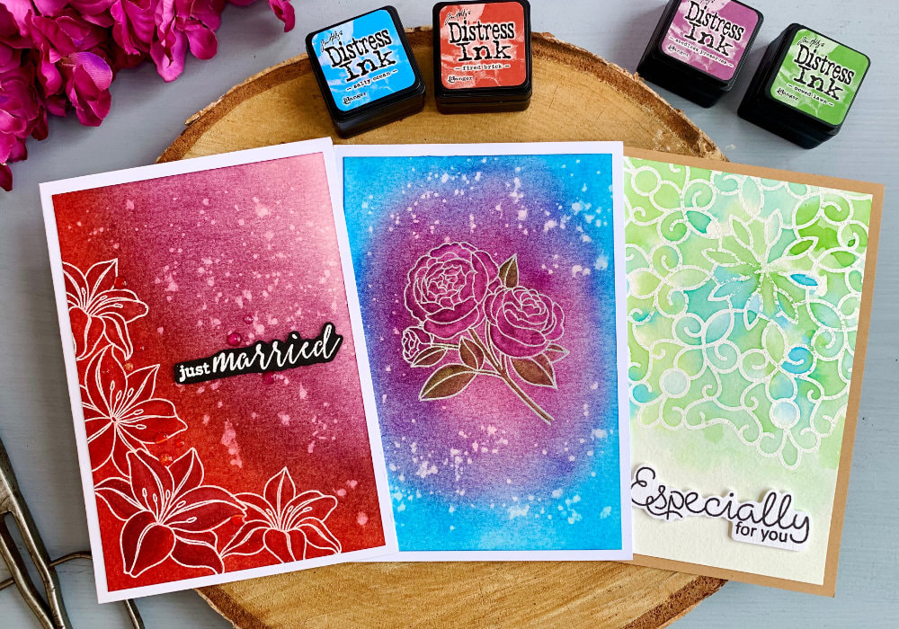
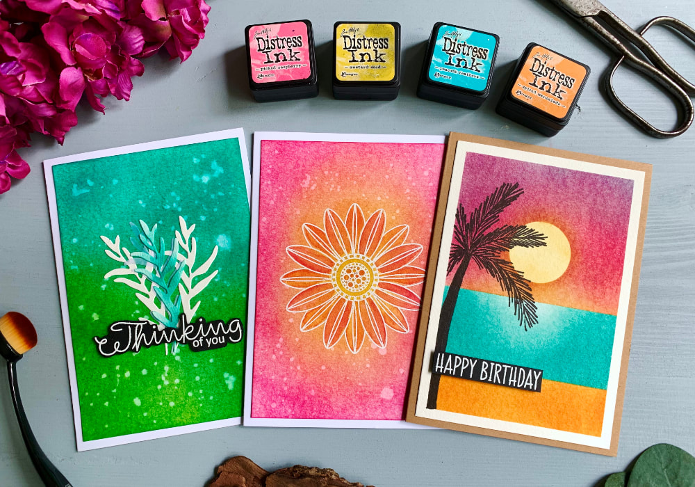
 Last year I started new Distress Ink colour combinations series where I use the kits with mini inks and see what colour combos I can create just with that particular kit, hence the Kit series. Just in case you don't know, you can buy single mini inks, the same as you can buy the full inks, but you can also get them in a pack of four, which is called kit. This is how I buy. I am quite behind in these series, I didn't realize that the blog post for the Kit #1, which you can watch here, was back in August. The reason for the long break was to make autumnal and Christmas cards. I thought I could squeeze one extra video in between, but it just didn't fit. The next colour combo will not take that long. 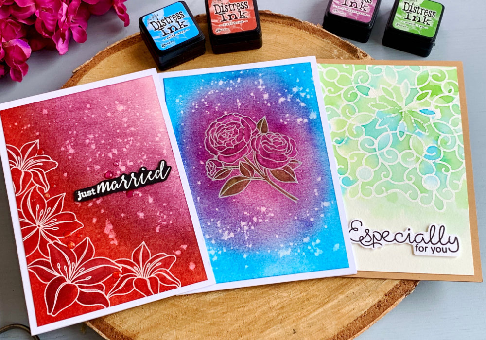 THE KIT #2 The kit consists of dark red, blue, green and purple and the ink names are:
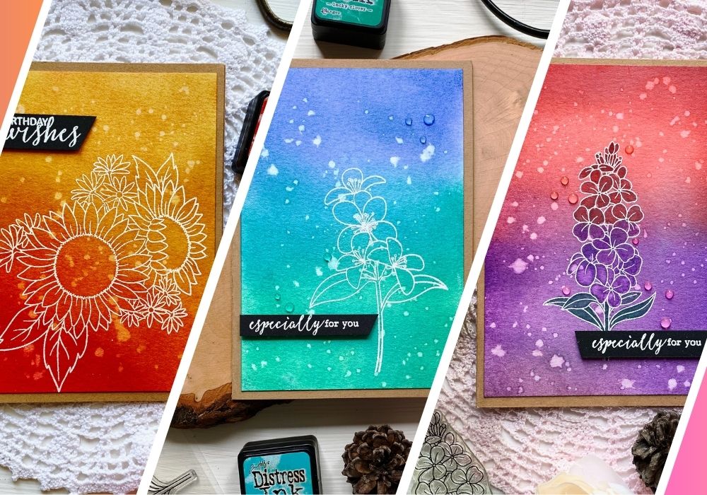
The inks in this kit belong to my must haves. Despite of this, I was dreading this kit a bit, because after I swatched the inks they looked quite gloomy. However, I managed to create a few colour combinations and along the way I created a few more which I showed in the video as samples. NOTE: The stamps I used for the cards are old, I just used what I had in my stash. These cards are not about the stamps, but the blending. You can use what ever stamps you already have. COLOUR COMBO #1: Fired Brick & Seedless Preserves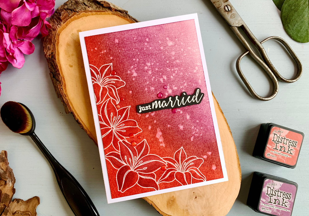 This is a quite predictable colour combo, red and purple. I actually created similar background before, you can check it out here, but there I used multiple inks. My idea here was to stamp single flower images in an L-shape, along the left and bottom edges of the card and then blend the inks over the flowers. I stamped and heat embossed the flower using a white embossing powder. Some of the images were overlapping, therefore I created masks using a full-adhesive post-it notes. To blend the inks, I started with the Fired Brick and covered all the flowers and then I switched to Seedless preserves and covered the rest of the background, fading the ink to lighter purple. 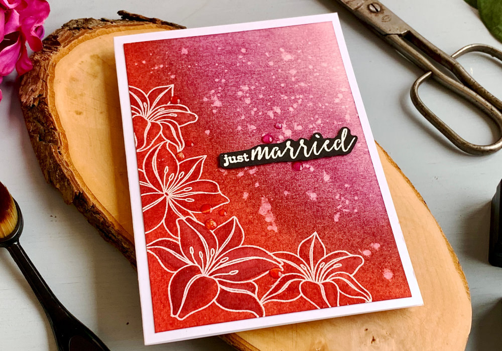 I applied a few layers, blending the colours together until I was happy with the look. Next I used the same inks as watercolours and painted the flowers. Two in red and two in pruple. This helps the images to stand out more. I also added splatter over the part that weren't stamped. Lastly I adhered the panel on top of a white card abase and added a greeting from the stamp set with the flowers and heat embossed it in white on a black card stock and fussy-cut. For the panel I used liquid glue and for the greeting I used a double-sided foam tape. COLOUR COMBO #2: Seedless Preserves & Salty Ocean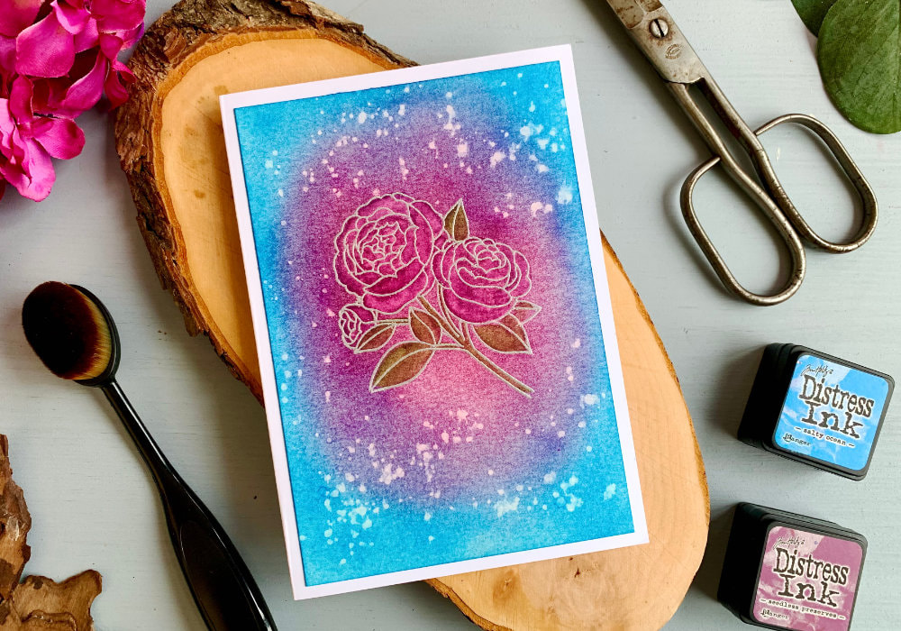 While blue and purple do go together, I wasn't overly excited about this colour combo, just because I'm not a fan of this particular blue. I still gave it a try and in the end I really liked it. I stamped a flower in the middle of the panel. I also heat embossed it, this time I used a silver embossing powder. Here the idea was to use the Seedless Preserves over the whole flower and the Salty Ocean on the rest of the panel, creating a circular shape.  Just as with the first panel, I was building up the colour. The mix of these colours actually creates a new shade of purple, which I really like. I also watercolored the flower and added splatter. I used the Seedless Preserves for the petals and for the leaves I used Mowed Lawn. The green combined with the purple created brown. This was perfect for the leaves. I adhered the panel on top of a white card base. I didn't add any greeting as I didn't know what to use and overall I don't think the card really needs it. COLOUR COMBO #3: Salty Ocean & Mowed Lawn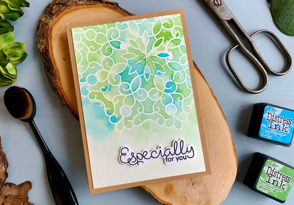 I was in a little pickle here, blue and green this was an another obvious colour combination. The problem was I created this colour combo in my video for the Kit #1. You can see it here. But I didn't want to repeat it. I could have created another colour combo, but when I tested Fired Brick with Salty Ocean and Seedless Preserves with Mowed Lawen. I didn't like the transition colour. Since then it grew on me, but that was a too late. What I decided here is to use those inks as watercolours and show you another way of using Distress inks.  I stamped a mandala stamp and heat embossed it in white. Then I squished the inks on a slick surface and using a brush and clean water I started painting. I did here the wet on wet technique, I first applied the water across the background and then I dropped in the ink. I picked up the ink with a damp brush and randomly applied the colour across the background, switching between the inks. I left the bottom part of the panel empty for the greeting, which I adhered using a foam tape. Lastly I adhered the panel on to of a card base. This time I used a card base made out of a craft card stock. 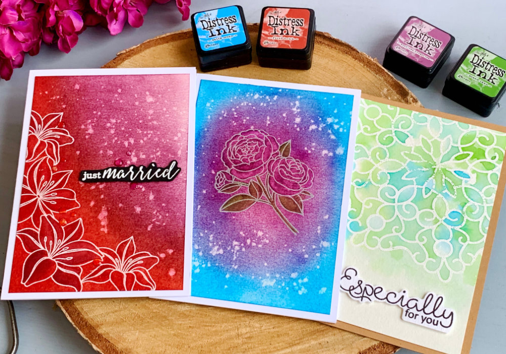 That’s it! These are all my Distress ink colour combinations for this blog post. You could create more, but unless I'm really inspired I want to keep the examples to three per blog post. I hope I inspired you and you will try making some of these yourself. Make sure you check out my video on YouTube and give it a Like as well. The list of product is down below, where you can also find a few blog posts that I think you might enjoy. And if you have any questions, just drop me a line. VIDEO TUTORIALWatch the video below or on my YouTube Channel. YOU MIGHT ALSO LIKE PIN MEDid you like the card? I would love, if you pinned it to your board on Pinterest! 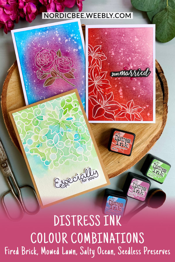
1 Comment
|
FOLLOW ME
SEE MORE
CATEGORIES
All
Stamping Die Cutting Using Stencil Heat Embossing Embossing or Texture Paste Distress Inks Nuvo Products Stamping & Colouring Stamping With Solid Stamps Watercolouring Watercolour Pencils Waterbased Markers Pencil Colouring Alcohol Markers Altenew Markers Zig Brush Markers Easy Backgrounds Stamped Backgrounds Small Stamp Ideas Simple Cards Complex Cards Cardmaking For Beginners All
Painting With Acrylics Painting With Gouache Painting With Watercolours Drawing With Fineliner Minimal Supplies Cards Christmas & Holiday
Love & Valentine Mother's Day Father's Day Halloween Spring Cards Summer Cards Autumn/Fall Cards Winter Cards Cards For Children Cards For Women Cards For Men Thank You Cards Sympathy Cards Get Well Soon Cards Floral & Leav Cards Rainbow Colours Messy Watercolouring Modern Art Inspirations Geometric Patterns Landscape Painting Acrylics
Gouache Watercolours Watercolour Pencils Waterbased Markers Distress Inks Alcohol Markers Colouring Pencils No Stamps No Dies Cards
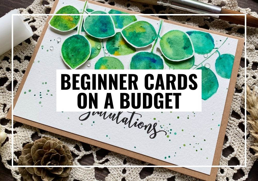
Cardmaking On A Budget Let’s Colour Quick Cards Fun Masculine Cards Background Ideas Distress Ink Combinations |
 RSS Feed
