
Poinsettia Digital Stamp Colouring With Fabe-Castell Plychromos | Christmas Cards 2022 #9 + VIDEO9/12/2022  There would not be Christmas cards, if I did not include a card with the poinsettia flower. It's my favourite Christmas plant and I actually kept the one from last year, I was surprised it survived. It doesn't have big red leaves, just tiny ones, but I'm happy with that. So for the card today, I drew my own sort of a bouquet with a poinsettia. This is a digital stamp, you can download it here and colour with me. I decided to use the Faber-Castell Polychromos colouring pencils. When I'm deciding which colouring method I will be using, especially when I'm just colouring, I often pick one I didn't use for a while and that's what I did here. Of course you can use what ever colouring method you want to.  As this is a digital stamp, I first printed it out. I used the Canson Bristol card stock, which I really like using with colouring pencils and I have no problems when printing. I cut my card stock to the size of my card base, in my case I used the metric size A6 (in the download you will also find US size A2) and before I pressed print, I also selected A6 in my printing software. Next I started colouring. When you watch other card makers colouring, they often talk about shading and picking a light source, creating shadows and highlights. And in my previous blog posts and videos I said that I'm not good at it, but recently I thought about it and that's not really true. I just don't care to learn. All I want to achieve is a little bit of depth, so it's not flat. 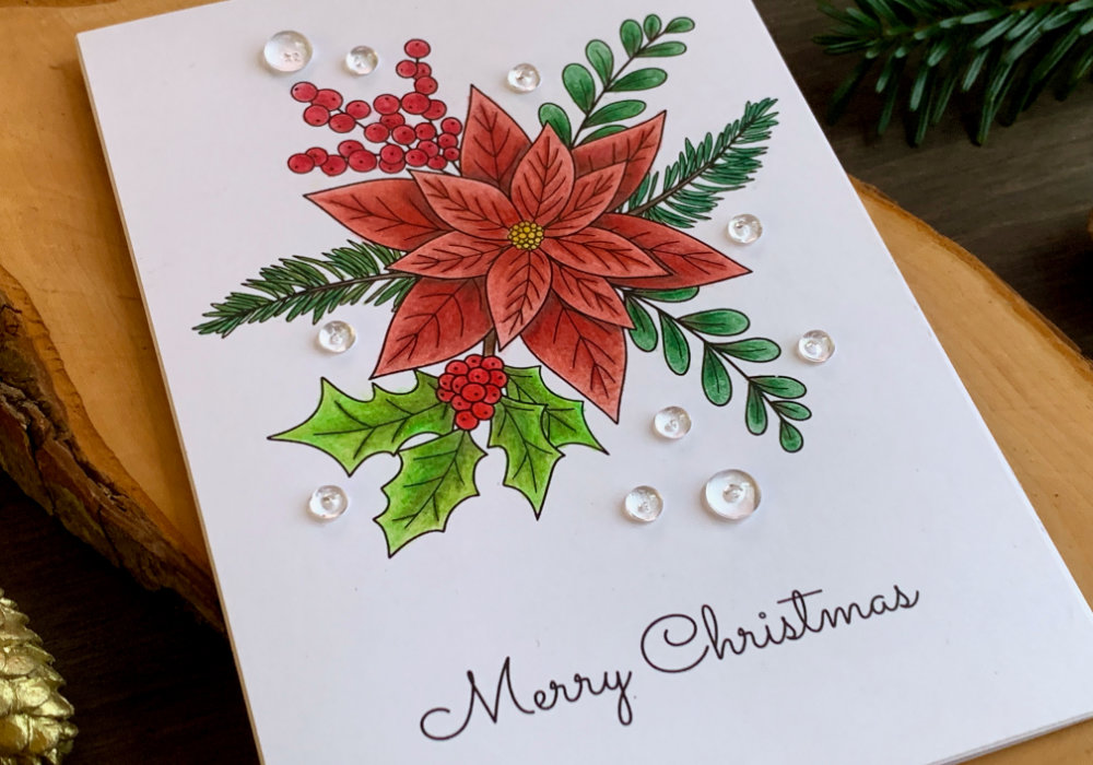 The way I do this, for leaves and petals I create an ombre effect, where I add the darker shade at the bottom and lighter at the top, creating a transition between them and blending them out. The only time when I'm thinking about shadows is when the petals are overlapping. On the poinsettia, I also used my darker pencil on those middle lines, which also created a really nice effect. When it comes especially to pencils, I tend to use two or three shades of the same colour, mostly two. However if I only have one, I press a little bit harder at the bottom or I add multiple layers and on the top I colour very lightly. To colour the middle of the poinsettia I picked two yellows and first I used the brighter one and then the darker one. I didn't spend too much time here as it's a very small part of the poinsettia.  One of the reasons why I picked the Faber-Castell, is that there were at least enough red shades for all of the images. To colour the poinsettia, I used three shades of red, for the top petals I used mid and light shade and for the bottom I used the mid and dark shade, plus brown to create shadows. The exact colours I used on the poinsettia are:
Next I coloured the berries and I applied the darker shade at the bottom of the berry (by bottom I mean the part that is closer to the stem) and lighter at the top, blending out the two colours together. And I did the same on the berries that were part of the branch with the holly.  The exact colours I used for the berries are:
For the leaves I didn't have that many greens, or more precisely greens I liked and that would fit together. So for the branch with leaves only, I used green and brown. Actually brown is a great alternative, if you do not have two shades of the same colour as it works with many colours. I applied the brown at the bottom of the leaf and then I combined it with the green, starting darker at the bottom of the leaf and as I was going to the top I soften the intensity of the application.  To colour the fir tree I used one brown shade for the stem and one for the needles. This was a little bit tedious to colour, but I knew this when I was drawing the fir tree branch. I could have drawn just simple lines, where colouring would not be needed, but I decided to draw each needle separately and I really like it. I was set on using different greens on each of the type of the green foliage, don't ask me why. So for the holly, even though I could have used one of the greens I already used on the other greenery, I picked new shades. First I was thinking using the Deep Cobalt Green, but I wasn't sure if it's going to be too bright, so I decided to use more subtle colours instead, with the addition of a brighter green, called Leaf Green. After I finished the main colouring with the subtle colours, which I coloured the same way as the poinsettia leaves, I went over it with the bright green. This made the leaves slightly brighter, without clashing with the other colours. 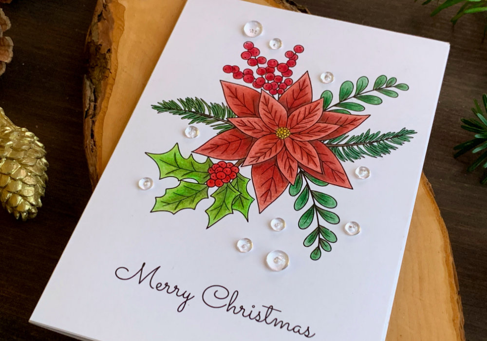 The exact colours I used for the leaves are:
Since I already included the greeting with the digital stamp, there was no need for stamping. So the last thing to do, was to adhere the panel on top of the card base. I used a white card base and a simple double-sided tape to adhere it.  I thought I was done, but I had a few places where I went outside of the lines, that I tried to erase. It did work, but I used this red and green eraser, which left a smudge at one spot above the berries. Here I thought the card was ruined, but I took out a few clear drops to see if it will fit with the image and if I can cover the smudge and it worked. I'm actually very happy that I added those clear drops as it makes the image more interesting. I hope you will try making this card yourself. Make sure you check out my video on YouTube and give it a Like as well. The list of product is down below, where you can also find a few blog posts that I think you might enjoy. And if you have any questions, just drop me a line. VIDEO TUTORIALWatch the video below or on my YouTube Channel. PRODUCTS USEDCLICK HERE TO SEE TO THE LIST OF PRODUCTS
NordicBee, Poinsettia Bouquet, Digital Stamp
NordicBee Faber-Castell, Polychromos Colour Pencils AmazonDE | AmazonUK Canson Bristol Card Stock 250gsm AmazonDE | AmazonUK Color Copy , White Paper, A4 300gsm/140lb (card base) AmazonDE | AmazonUK Papermania, A6 Card Bases + Envelopes, White AmazonDE | AmazonUK Pretty Pink Posh, Clear Droplets 4mm PrettyPinkPoshUS Pretty Pink Posh, Clear Droplets 6mm PrettyPinkPoshUS UHU, Liquid Glue AmazonDE | AmazonUK Sellotape Double Sided Tape AmazonDE | AmazonUK Fiscars, Guillotine A5 AmazonDE | AmazonUK Tonic Studios, Guillotine A4 AmazonDE | AmazonUK Crafting Mat, Black AmazonDE | AmazonUK Disclaimer: Here you can find the products I used to make this card. Please note that the products are just a guide, you don't need the exact products or brands. For most of the products I include links to the shops where you can purchase these items if available. As I live in Europe, I provide links to UK and German stores. These are not affiliate links and every products I used for this card I purchased myself. YOU MIGHT ALSO LIKEPIN MEDid you like the card? I would love, if you pinned it to your board on Pinterest! 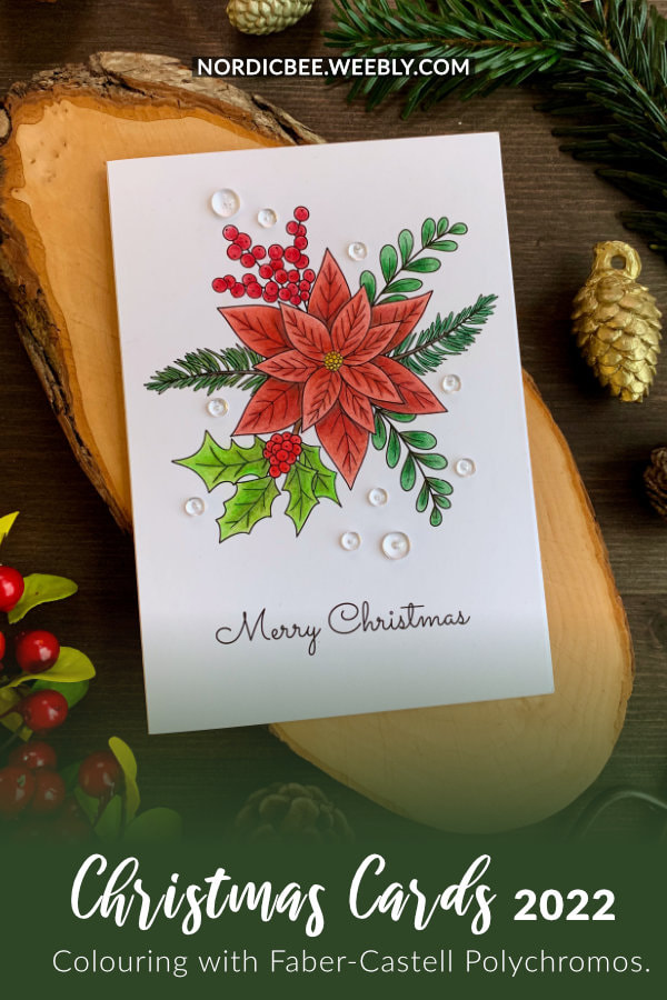
0 Comments
Leave a Reply. |
FOLLOW ME
SEE MORE


CATEGORIES
All
Stamping Die Cutting Using Stencil Heat Embossing Embossing or Texture Paste Distress Inks Nuvo Products Stamping & Colouring Stamping With Solid Stamps Watercolouring Watercolour Pencils Waterbased Markers Pencil Colouring Alcohol Markers Altenew Markers Zig Brush Markers Easy Backgrounds Stamped Backgrounds Small Stamp Ideas Simple Cards Complex Cards Cardmaking For Beginners All
Painting With Acrylics Painting With Gouache Painting With Watercolours Drawing With Fineliner Minimal Supplies Cards Christmas & Holiday
Love & Valentine Mother's Day Father's Day Halloween Spring Cards Summer Cards Autumn/Fall Cards Winter Cards Cards For Children Cards For Women Cards For Men Thank You Cards Sympathy Cards Get Well Soon Cards Floral & Leav Cards Rainbow Colours Messy Watercolouring Modern Art Inspirations Geometric Patterns Landscape Painting Acrylics
Gouache Watercolours Watercolour Pencils Waterbased Markers Distress Inks Alcohol Markers Colouring Pencils No Stamps No Dies Cards
Cardmaking On A Budget Let’s Colour Quick Cards Fun Masculine Cards Background Ideas Distress Ink Combinations |

 RSS Feed
