
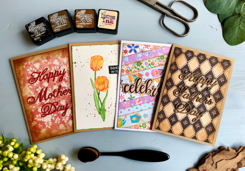
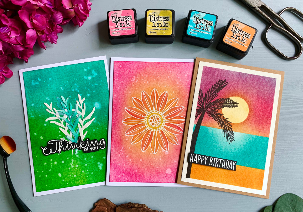
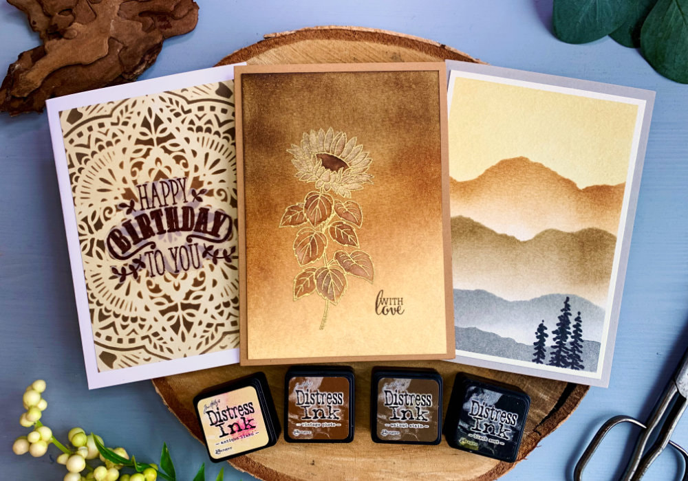
 While the Mini Distress Ink Kit #3 doesn't have the most exciting colours, the colours are Antique Linen, Vintage Photo, Walnut Stain and Black Soot. It is my must-have Kit! This is because of the other things you can do with the individual inks and it’s not just blending. So after I showed some of the colour combos you can do with the inks in this Kit. I thought I make a bonus post and show you what else you can use these inks for. HELP DIFFERENT PATTERN PAPERS BLEND BETTER TOGETHER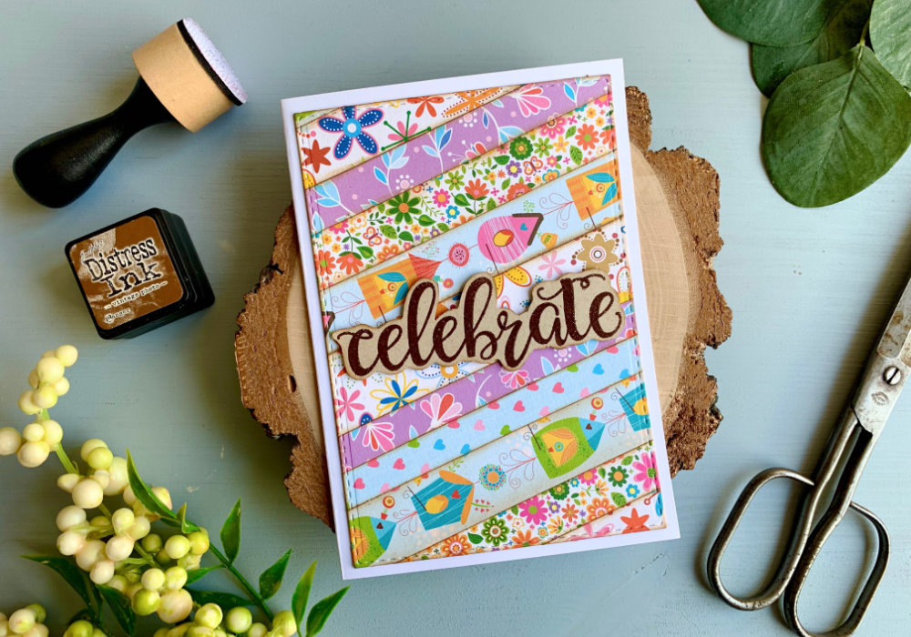 When you are using multiple pattern papers with various patterns and put them together against each other, often they clash. To fix this and help them to blend better together, you can use Distress inks along the edges. You can either pic ink colour of the pattern paper or a brown ink, which is a neutral colour. I like to use the Vintage Photo or Walnut Stain. In my example I cut stripes in various thicknesses using different pattern papers. And I applied the ink along the edges. At first I had the paper on my desk and went over the edges this way. This adds also a bit colour to the paper. Normally I would not mind because I mostly use pattern papers with a vintage look and there it just blends in. Here I didn’t like it. 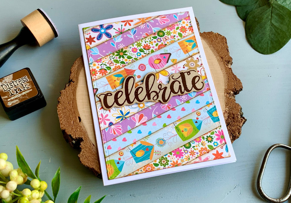 I haven’t done this technique for a few years and back then I only had the Ranger blending tool. So I switched to that. And I also remembered, I often lifted and tilted the paper and only went with the blending tool along the edges. I didn’t put much ink onto the pattern paper. I did this on all of the stripes and then I adhered them together on top of a backing paper. Because of the ink the stripes blended together very well. GIVING PATTERN PAPER AGED LOOK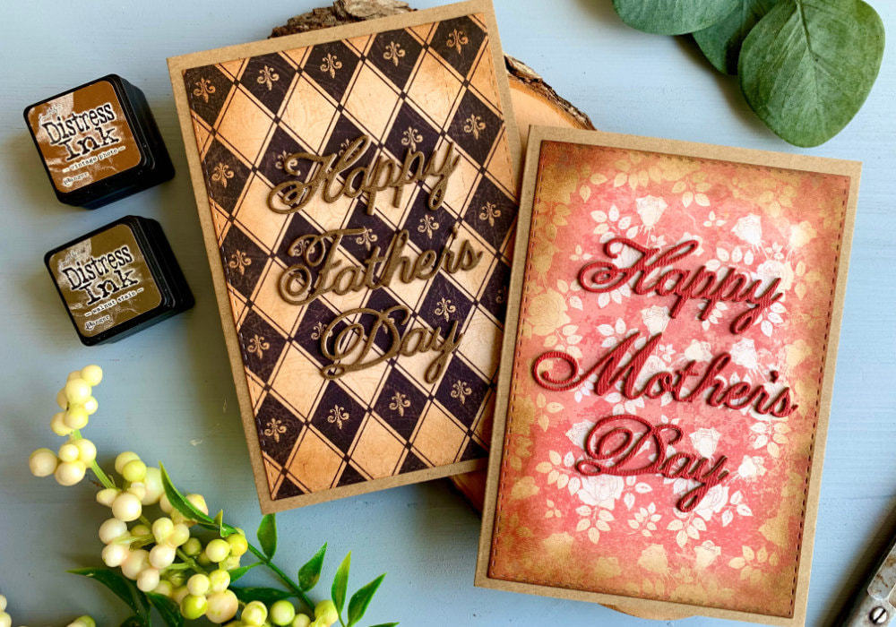 Another thing you can do with pattern papers and brown Distress inks, especially vintage pattern papers, is to give them more aged look. Just like in my previous example, I like to use either Vintage Photo or Walnut Stain. This time I used one pattern paper, instead of multiple ones and I cut it down to the size of my card. To be more precise I used a stitched rectangular die. I applied the ink along the edges again, but here I covered large portion of the panel, leaving the middle without any ink. How much ink you apply is up to you. This technique is a great way to help your pattern paper, especially the vintage ones, to look more aged. I made two cards for Mother's Day and Father's Day. I had dies which I die-cut multiple times to give the card a bit demotion. MAKING COLOURS DARKER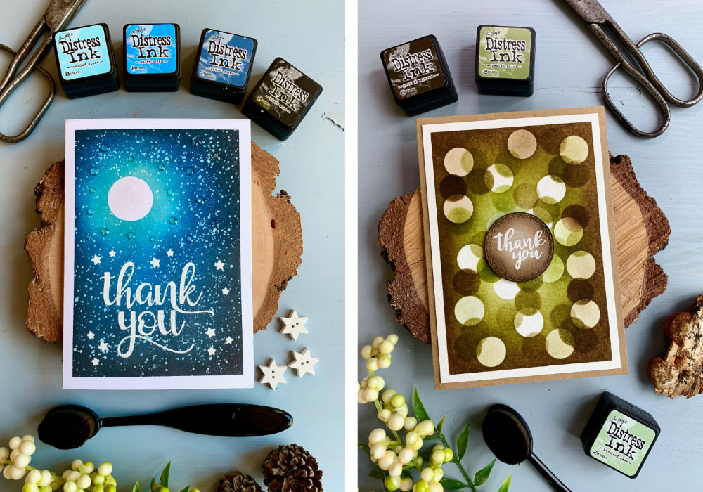 Whenever I use other colours for background and I want to make the outer colour really dark then I use Black Soot. This is perfect for night or evening skies like sunsets, but you can use it anytime you wan to darken the colours. You can apply it light or do a heavier application to control the shade. If however the Black Soot is too dark you could use brown inks such as Vintage Photo or Walnut Stain. I like to use brown to darken colours when I'm using colours like greens or reds. It just fits well and gives the background very interesting look. CREATING GALAXIES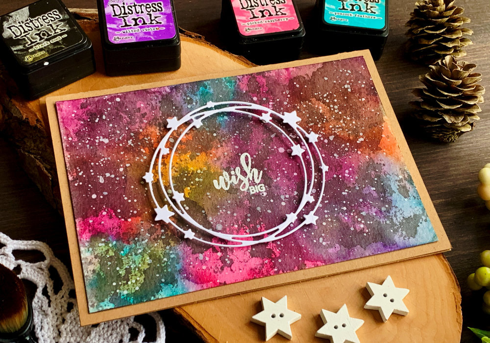 One of the best and fun uses for the Black Soot is to create galaxy backgrounds. While I have never done a typical colour blending of a galaxy using Distress inks. Well, not for the blog. I did create galaxy doing the ink smooshing technique and I followed pretty much the same steps. If you would like to see the card, click here. You start with the brighter colours and then you go in with the Black Soot and not only you add black around the colourful areas, but also over them, leaving some part birther some darker. You want to create muddy colours. This will look like a hot mess, but after you add some stars it will come together. NO LINE COLOURING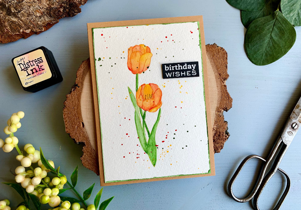 The Antique Linen might look boring and dull, however it is a great colour for no-line colouring, or watercolouring. You probably might be able to use the inks with non-watercolour products, but I haven't tested it. To do the no-line colouring you ink up your stamp and stamp the image on top of your card stock. And then you start colouring. Since the lines are very light it will blend with your colouring method. Especially with watercolours since Distress inks are water-based. You can actually use the Distress inks for colouring. For my card I used stamp with tulips and coloured it with watercolours. I also used watercolour pencils for smaller details.  Those are my uses for these inks. I hope you will try some of the techniques yourself. Make sure you check out my video on YouTube and give it a Like as well. Below you can also find a few blog posts that I think you might enjoy. And if you have any questions, just drop me a line. VIDEO TUTORIALWatch the video below or on my YouTube Channel. YOU MIGHT ALSO LIKEPIN MEDid you like the card? I would love, if you pinned it to your board on Pinterest! 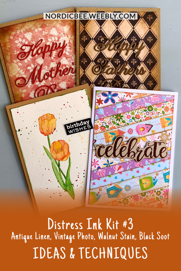
0 Comments
Leave a Reply. |
FOLLOW ME
SEE MORE
CATEGORIES
All
Stamping Die Cutting Using Stencil Heat Embossing Embossing or Texture Paste Distress Inks Nuvo Products Stamping & Colouring Stamping With Solid Stamps Watercolouring Watercolour Pencils Waterbased Markers Pencil Colouring Alcohol Markers Altenew Markers Zig Brush Markers Easy Backgrounds Stamped Backgrounds Small Stamp Ideas Simple Cards Complex Cards Cardmaking For Beginners All
Painting With Acrylics Painting With Gouache Painting With Watercolours Drawing With Fineliner Minimal Supplies Cards Christmas & Holiday
Love & Valentine Mother's Day Father's Day Halloween Spring Cards Summer Cards Autumn/Fall Cards Winter Cards Cards For Children Cards For Women Cards For Men Thank You Cards Sympathy Cards Get Well Soon Cards Floral & Leav Cards Rainbow Colours Messy Watercolouring Modern Art Inspirations Geometric Patterns Landscape Painting Acrylics
Gouache Watercolours Watercolour Pencils Waterbased Markers Distress Inks Alcohol Markers Colouring Pencils No Stamps No Dies Cards
Cardmaking On A Budget Let’s Colour Quick Cards Fun Masculine Cards Background Ideas Distress Ink Combinations |
 RSS Feed
